
I really like this!
Can we make a poll on the new logo?
9 Likes
Good, but a refined one will much great
5 Likes
I like the idea, but this can not be used in small format. The details would be lost.
4 Likes
Rough drafts
Black hole -> Black box
very basic
or black hole but different
(into …)

and more different
12 Likes
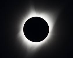
Second looks good. What if we call it an “eclipse” instead of a black hole?
The eclipse of crypto has a much brighter tone than the black hole of crypto. Also more rational. The black hole basically destroys everything, an eclipse is a beautiful natural event which “hides the sun”, the “center of our world”. (Bitcoin)
Reference: RECAP - PRV Holders Call May '20
8 Likes
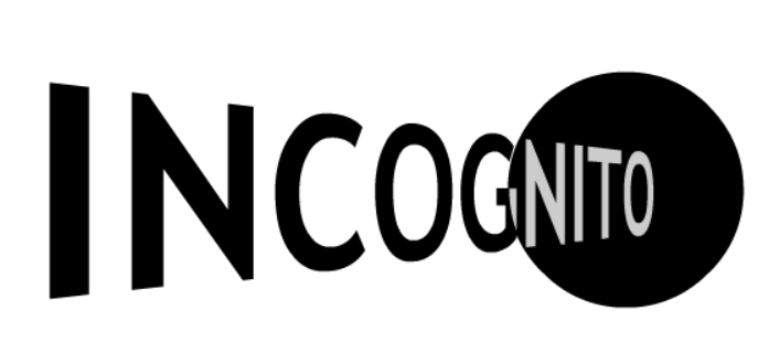
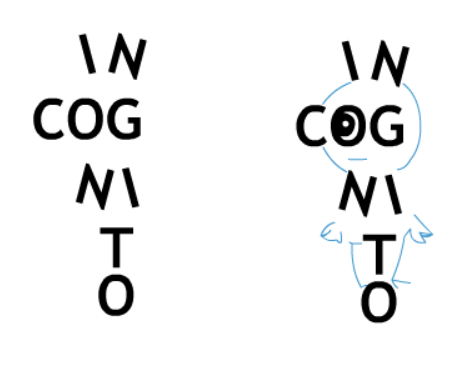
This can not be used, but I keep seeing a little guy looking to the left, in the name Incognito.
Probably just me ¯_(ツ)_/¯
8 Likes
@Jamie I would have to disagree on the content not being able to work on small format, just look at the upload logo when writing a message on this forum from your phone, it’s minuscule but the details aren’t lost. That being said I’m not hardcore advocating for it as a logo, I might use it for shirt designs etc., so I don’t have a strong opinion, just want to push back on scalability. With hi res and precision we have now, almost anything can be scaled for small format haha
Secondly, I really like your second design! Agree with @raz the idea of an eclipse, the moon hiding the sun is natural and you know the sun is coming back haha Actually, if we move forward with shirts and glasses etc, I might have to ask you for the hi res, if you’d be willing to share, I think this is a great design for swag.
I’m kind of neutral on the third design, but not for any specific reason, just not finding it as aesthetically pleasing as the second.
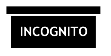
Not a fan of the the first box design, I don’t really get it. Might send the wrong message.
The box idea is contradictory to “escaping traceability” and kind of gives a feeling of being trapped or having a specific location. It would feel more like a storage system than a platform for unlimited untraceable money transaction.
7 Likes
Love the second one - having ‘cogni’ in the shadow is clever!
7 Likes
Yea, agreed, I was actually wondering if @Jamie just put the cogni in the shadow to be symmetric or if it was deliberate to highlight “into” which if it was a happy accident that’s awesome, if it was deliberate, I’m impressed. Cool design. “Into incognito” more or less
4 Likes
@Bruno Could you make a logo with @Jamie 's idea?
but as an eclipse like
I don’t know how to combine it elegantly, maybe search for vector graphics for the sun first and hide it with a circle or you could keep it realistic with a free photo from Google Images. If you decide to make it with a photo, please keep it high-res.
10 Likes
I was just playing, I have no intention to fight anyone over these.
The black box of an airplane, which is not black at all, holds all info of a flight plus voice recordings, but none of that can be used without decoding it first. That is the relation with the black box. There is an analogy with Incognito I think. But you are right, if you need half an hour to explain it, it doesn’t work.
Your design will look absolutely great on a t-shirt for sure. I was just picturing the image in a 45 x 45 avatar and imagined the little figure would be lost when the o’s transform into mainly black dots.
6 Likes
It was deliberate, didn’t know if it was obvious. That is why I added it to the text as (into…). It is a little off center, as I said it was a draft version.
6 Likes
ooh sorry i missed that haha, but yes great design, very well thought out. I was looking at something similar with ways to highlight “go” but i didn’t spend enough time with it. might play around with it tonight, but if you have any thoughts let me know 
5 Likes
I get a vision of a gif where “go into” morphs into “incognito”, but that is no good for a logo/avatar.
6 Likes
To me, if there was a hole, it should cover “in” syllable etymologically.
8 Likes
What about a logo that has the outline of a wallet with the PRV symbol in the middle bright and blue like it was, then all around the wallet partially (incognito mode) hidden are the other top coins/ a few project coins?
5 Likes
This is magical and mystifying and I would invest another $20k based on this logo alone (  )
)
I really like the eclipse idea. It goes with our purpose of “shielding”.
If the entire circle cant be made into an eclipse, maybe just the “O” inside the circle could be made into an eclipse? But definitely best with the whole circle as an eclipse.
5 Likes
I think you mean similar logos to below: 


For the posters, we may use a similar scheme to this:

For the heads, we may use the heads of the core team as the heroes of Incognito. In addition to this, if the community doesn’t mind, we may use the heads of the most-known villains in the world history to take the attention of both the criminals and the governments 
7 Likes
 yes, exactly that! Lol.
3 Likes